Efficient image optimization has become essential in modern web development. With the rising diversity in devices and screen resolutions, the pressure on delivering high-quality images without sacrificing performance has intensified. Poorly optimized visuals can slow down websites, reduce user engagement, and negatively impact SEO. Today, techniques such as using the AVIF format, understanding device pixel ratios (DPR), and implementing art direction are shaping how developers deliver optimized images.
Introduction to Modern Image Optimization
Table of Contents
Historically, optimizing images meant simply compressing JPEGs or PNGs and maybe serving smaller dimensions for mobile users. However, with the increasing sophistication of web platforms and varying screen technologies, image optimization has transformed into a multifaceted discipline. Factors like file formats, display resolutions, responsive layouts, and user experience (UX) all play a role in deciding how an image should be delivered.
Three key components of modern image optimization are:
- AVIF – a new image format that provides superior compression and quality.
- DPR (Device Pixel Ratio) – a measure of screen density that affects image clarity.
- Art Direction – tailoring images to different layouts and contexts to improve visual storytelling.
AVIF: Next-Generation Image Format
AVIF (AV1 Image File Format) is a relatively new image format developed from the AV1 video codec. It offers significant advantages over traditional formats such as JPEG, PNG, and even WebP. Notably, AVIF is able to:
- Provide higher compression rates without noticeable loss in quality.
- Support HDR (High Dynamic Range) imaging.
- Include capabilities such as lossless compression, transparency, and animation.
When an image is saved in AVIF, the file size is often 30% to 50% smaller compared to JPEG or WebP, with the same perceptual quality. This reduction leads to faster load times and less bandwidth usage—an essential benefit for mobile users and slower networks.
However, it’s important to keep browser support in mind. While AVIF is widely supported in modern browsers like Chrome, Firefox, and Edge, fallback strategies (e.g., serving WebP or JPEG through the <picture> element) should still be part of a robust delivery system.
Example: A <picture> element could be set up like this to support AVIF with fallbacks:
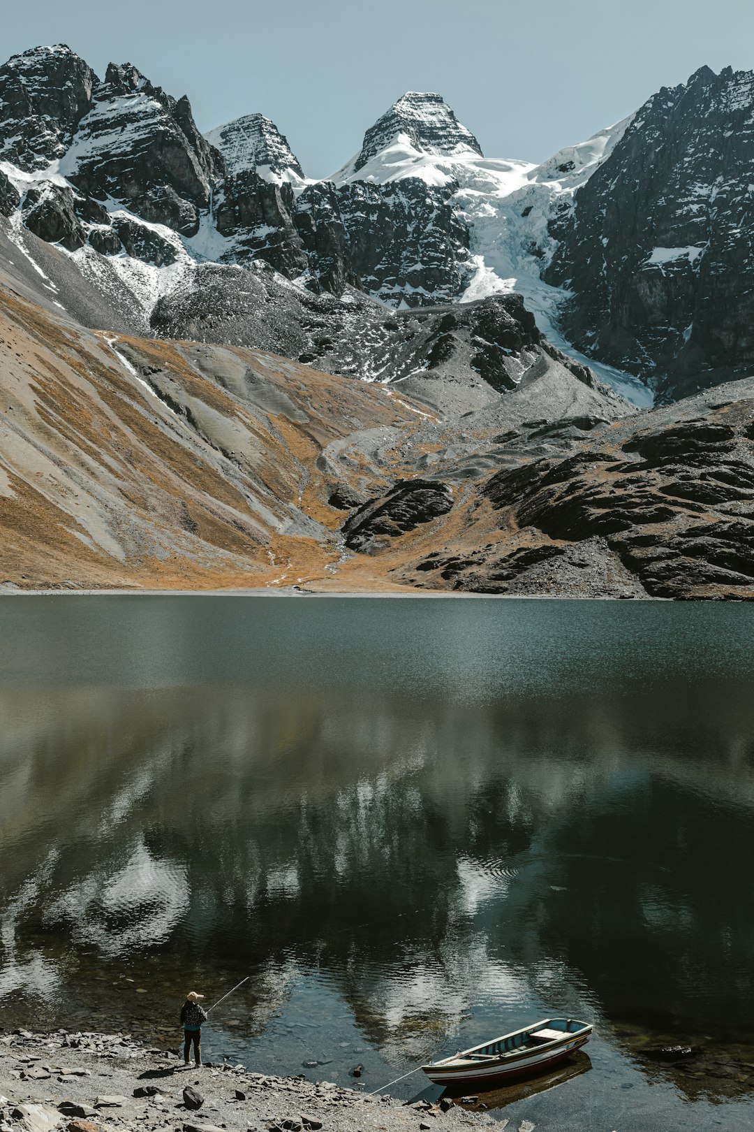
<picture>
  <source srcset="image.avif" type="image/avif">
  <source srcset="image.webp" type="image/webp">
  <img src="image.jpg" alt="A scenic view of mountains">
</picture>
Using AVIF should be a default practice for any project that values performance, provided fallbacks are in place for legacy support.
Understanding Device Pixel Ratio (DPR)
The Device Pixel Ratio is a key factor in how images appear on different screens. It refers to the ratio of physical pixels on a device to the logical (CSS) pixels used in the browser. For instance:
- A standard display has a DPR of 1.
- “Retina” and high-DPI displays typically range between 2 and 3.
This means that an image set to occupy 200px in CSS on a device with a DPR of 2 is actually shown on 400 physical pixels. If the server only provides a 200px-wide image, it will appear blurry due to upscaling. To counter this, websites must serve appropriately scaled images for each DPR.
This is typically achieved using the srcset attribute in the <img> tag:
<img
  src="image-1x.jpg"
  srcset="image-1x.jpg 1x, image-2x.jpg 2x, image-3x.jpg 3x"
  alt="Product image close-up">
By specifying images at different resolutions, the browser can automatically choose the most suitable version based on the device’s pixel ratio. This ensures clarity and crispness on all devices while avoiding unnecessary data usage.
When to Use DPR-Based Scaling
DPR scaling is especially important in the following scenarios:
- Product images where detail matters (e.g., e-commerce).
- Logos and interface icons presented on retina screens.
- Hero images or sliders on desktop that should look flawless on high-resolution monitors.
Art Direction in Responsive Images
While AVIF and DPR-based scaling focus on format and resolution respectively, art direction addresses what part of the image is shown at different screen sizes and contexts. It’s not just about responsive images that scale — it’s about changing the composition of an image to suit each layout.
In practical terms, art direction often involves cropping or switching to a different image entirely depending on the screen size. This can be done using media queries inside the <picture> element:
<picture>
  <source media="(min-width: 1024px)" srcset="desktop-banner.avif" type="image/avif">
  <source media="(min-width: 768px)" srcset="tablet-banner.webp" type="image/webp">
  <img src="mobile-banner.jpg" alt="Sale banner adjusted for mobile layout">
</picture>
In this setup, high-resolution desktops see a wide-angle banner, tablets get a medium crop, and mobile users see an image optimized for vertical layouts. This method preserves design consistency and improves comprehension across screen sizes.
Why Art Direction Matters
Consider a site showing a group photo in the hero section. On a widescreen monitor, all individuals are visible. But when viewed on a mobile phone, the reduced width can crop out half the faces. With art direction, a cropped photo focusing on the central characters can be served to mobile users, preserving the message and visual impact.
Good art direction complements user experience by ensuring:
- Important visual elements are retained.
- Images feel natural within the layout.
- Visual hierarchy is respected, regardless of screen size.
Combining Strategies for Best Results
Although each technique—AVIF, DPR, and Art Direction—can be used individually, they realize their full potential when combined. A modern, optimized image strategy might look like this:
<picture>
  <source
    media="(min-width: 1024px)"
    srcset="promo-desktop.avif 1x, promo-desktop@2x.avif 2x"
    type="image/avif">
  <source
    media="(min-width: 768px)"
    srcset="promo-tablet.webp 1x, promo-tablet@2x.webp 2x"
    type="image/webp">
  <img
    src="promo-mobile.jpg"
    srcset="promo-mobile.jpg 1x, promo-mobile@2x.jpg 2x"
    alt="Promotional image tailored for mobile layout">
</picture>
This approach ensures that:
- Format is optimized via AVIF or WebP.
- Resolution is adaptively delivered based on DPR.
- Composition is adjusted for screen size via art direction.
Challenges and Considerations
Despite its advantages, implementing modern image optimization strategies comes with considerations:
- Increased complexity: Using multiple file formats and size variants demands a more advanced image generation and deployment pipeline.
- Storage requirements: Serving 1x, 2x, and 3x versions in AVIF, WebP, and JPG can increase storage usage if not managed carefully.
- Testing overhead: Ensuring compatibility and performance across browsers and devices can be time-consuming.
Conclusion
Today’s users demand faster, more visually rich digital