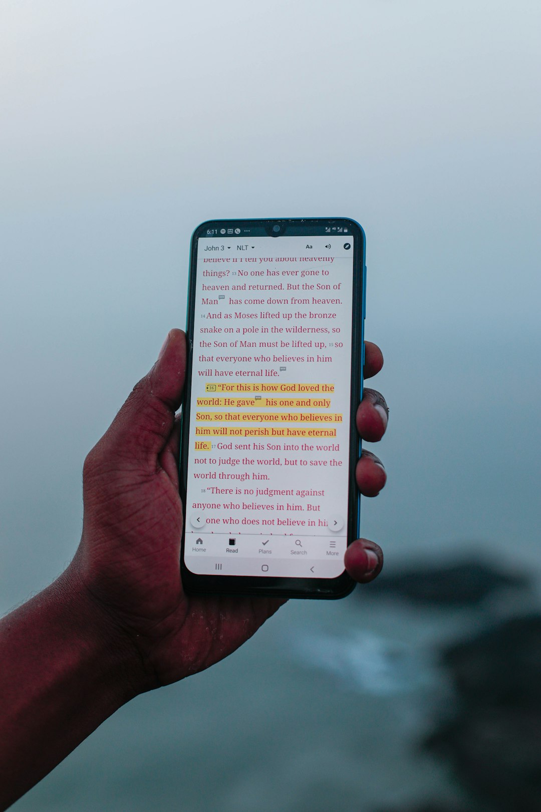
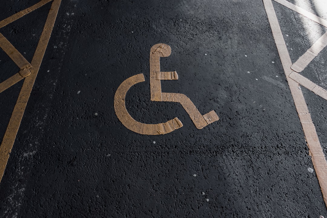
Imagine your website is a building. If someone in a wheelchair can’t get through the door, there’s a problem. The same goes for the web. Making your site usable for everyone isn’t just kind—it’s necessary. Web accessibility helps people with disabilities use your website. And the best part? You can keep your site accessible with simple monthly checks.
What Is a Web Accessibility Audit?
Table of Contents
A web accessibility audit is like giving your site a quick health check. You’re looking for things that might stop someone from using it.
Think of users who:
- Use screen readers
- Have limited vision or color blindness
- Can’t use a mouse
- Have learning difficulties
A monthly audit helps you catch issues early. They’re quick, not too technical, and best of all—they protect user happiness (and your reputation!).
Why Monthly?
Things change fast online. You might:
- Add new content
- Update a plugin
- Launch a promotion
Each of those changes could introduce accessibility issues. A simple checkup every month keeps those bugs in check.
What Should You Check Each Month?
You don’t need to be a web wizard. Just look out for a few common things. We’ve broken it down for you below.
1. Check All Images for Alt Text
Every image should have alt text. This tells screen readers what the image shows.
Ask yourself:
- Does every image have an
altattribute? - Does the text describe the image clearly?
Placeholder alt text like “image123.jpg” doesn’t help. Write something like “A smiling dog wearing sunglasses.”

2. Use a Contrast Checker
Light gray on white? Tiny yellow on blue? No thanks! Poor color choices make your content unreadable.
Use tools like the WebAIM Contrast Checker. Paste your text and background colors in, and it will tell you if it passes.
Make sure your site has good contrast for:
- Text and backgrounds
- Buttons and links
- Hover states and focus styles
3. Keyboard Navigation
Try navigating your site with a keyboard only. No mouse allowed!
Use the Tab key to move through links and interactive elements. Here’s what to look for:
- Can you see a clear focus indicator (like a border or highlight)?
- Can you reach every link, button, and form input?
- Does the order make sense?
If your site is a maze for keyboard users, fix it!
4. Labels and Form Elements
Forms should always have labels. Screen readers rely on them.
Check each form input:
- Is there a label next to or above it?
- Is the label clear (e.g. “Email address” instead of “Input field”)?
- If the label is hidden for design reasons, is it still in the code?
Also test submitting the form. Are there *accessible* error messages?
5. Headings Hierarchy
Headings (like <h1>, <h2>, etc.) aren’t just for looks—they tell screen readers what’s what.
Every page should have:
- One
<h1>(the main title) - Logical subheadings with
<h2>,<h3>, etc.
Never skip from <h1> to <h4>. That’s like jumping from chapter 1 to chapter 4 with no context.
6. Link Text That Makes Sense
Link text should say where it goes—not just “Click here.”
Ask yourself:
- If someone only hears the link, will they know what it does?
- Can I be more descriptive? Like “Download our monthly menu” instead of “Click here.”
7. Use an Automated Scanner
Use a free scanner like:
- WAVE by WebAIM
- axe DevTools (browser extension)
- Lighthouse in Chrome DevTools
Scan a few pages each month. These tools highlight issues such as:
- Missing alt text
- Low-contrast text
- Empty buttons or links
They’re not perfect, but they’re great for catching the easy stuff!
Make It a Routine
Don’t wait for your annual redesign to fix problems. Here’s a cute little routine to follow each month:
- Pick 3 random, high-traffic pages
- Do your keyboard test
- Run the contrast checker
- Check headings and alt text
- Scan with your chosen tool
- Log what you find—and fix it!
You can even gamify it. Make it a challenge for your team: “Who finds the most accessibility wins this month?”
Bonus: Involve Real Users
Once a quarter, go beyond your team. Ask someone who uses assistive technology to try your site. They’ll catch things you miss.
Think of it like asking someone to test your cooking. Better feedback = better site.
Accessibility Is for Everyone
Here’s the thing—accessibility doesn’t just help people with disabilities. It can improve:
- Mobile users with bad connections
- Older users who might not be tech-savvy
- People multitasking with audio only
Accessibility = better user experience for all.
Set a Reminder, Save a User
Set a recurring calendar reminder: “Accessibility Audit – 30 mins.” That’s all it takes. Your site will be stronger, faster, and kinder.
Need motivation?
Picture a user who finally finds the info they need—because you made it possible.

Now Go Audit!
Accessibility isn’t a buzzword. It’s a responsibility. And by building these checks into your monthly routine, you’re creating a better web for everyone.
So get out there. Audit your site. Fix the little things. Your users are counting on you!